0

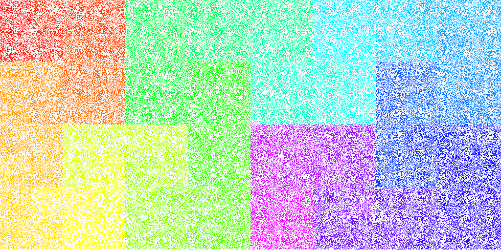
How do I understand Hilbert's map in this answer? The author of the answer has mapped the hash value (integer) of some strings to a 2D image. I understand that Hilbert's curve is a technique for 1D <=> 2D transformation which preserves locality of the points.

My question is, what can I infer from this 2D image about the different hashing algorithms? I understand that two strings having nearby hash values are transformed to nearby dots in the image (but the opposite is not true). But, what information does this say to me? Do they say any information about collisions? If yes, how ?

NOTE: The author's cooment in his answer in the link: i assume you mean the images though. For "linear" map i created a square bitmap of size nxn, (where n = Ceil(sqrt(hashTable.Capacity))). Rather than simply black for list entry is occupied and white for list entry is empty, i used an HSLtoRGB function, where the hue ranged from 0 (red) to 300 (magenta). White is still an "empty list cell". For the Hilbert map i had to hunt wikipedia for the algorithm that turns an index into an (x,y) coordinate. – Ian Boyd

  • I understand why the author of the answer uses n=Ceil(sqrt(hashTable.Capacity)) (my guess: magnitude of area of the image = length of hash table)
  • I understand white color says that no string has been hashed to those locations. But what do the remaining colors say?
1
  • 1
    nearby hash values are transformed to nearby dots in the image (but the opposite is not true) That's precisely the point of the Hilbert map. When using it, the converse is mostly true as well, although not always.
    – Ordous
    Commented Sep 19, 2017 at 14:12

3 Answers 3

0

... is a technique for 1D <=> 2D transformation ...

Yes, the 1D ordinal is the hash value, and it's transformed to a 2D co-ordinate in the image

... which preserves locality of the points.

So adjacent hash values will be adjacent points in the image. That means that if some hash value ranges are rarely used, and others are densely used, it will be visible in the output. In other words, it visualises uniformity of the hash values over their output range.

It doesn't tell you anything about collisions. The colour hints at the spatial grouping of hash value ranges, but is more decorative than useful IMO.

Consider some examples of bad hash functions:

  1. if some hash function never set the top bit of its output value, half of either sort of graph will be white (the linear map would have the top half all white, and the Hilbert map would have lots of big white squares)
  2. if some hash function never set the bottom bit, half of the graph will still be white, but in this case the linear map will show clear white vertical lines, and the Hilbert map won't be so useful
  3. if there are shortish ranges of consecutive values which are never set, they might be easier to spot as squarish white grains in the Hilbert map, than as short horizontal white lines scattered around the linear map.

Edit: the original image linked for easy perusal.

the original image linked for easy perusal

2
  • Thanks for the answer. You said: "if some hash function never set the top bit of its output value, half of either sort of graph will be white (the linear map would have the top half all white". I assume by top bit, you mean the MSB. And also I assume that you are taking uint numbers. If MSB is not set, it means the number is small. So the hash function always outputs small numbers. As small numbers occupy top part of the linear map, the top part must be colored and lower part must be completely white and not as you have mentioned. Am I correct? Commented Sep 19, 2017 at 17:47
  • 1
    Yes, the top bit is the highest value bit, and yes I'm assuming unsigned integers since I've never seen a hash function that outputs signed values. If the top bit is not set, half of the entire map will be white, for both maps, because half of the integer's range is unused. I didn't really worry about which half, since I don't recall the other answer detailing which way up the linear map was.
    – Useless
    Commented Sep 20, 2017 at 8:48
1

Both visualizations map 1D to 2D. The "linear" visualization is akin to mapping 1-9 to the positions

1 2 3
4 5 6
7 8 9

Whereas the Hilbert map is more like

1 2 9
4 3 8
5 6 7

The colors in the image are just a gradient from red at the minimum (1) to purple at the maximum (9). So in the first case you get a smooth gradient from top to bottom, in the second you would get clear borders e.g. where 2 borders 9.

There are two "shortcomings" to the linear approach: first, the "width" of 3 is arbitrary and may have nothing to do with the hashing algorithm. This can make it harder to see problems in the output. For example, suppose this hash never outputs 2, 5, or 8

1   3
4   6
7   9

This is a tiny, silly example, but having a big vertical gap like that would be a problem for a real hash. But, if you use a width of 2...

1
3 4
  6
7
9

Now it actually looks "random". The second shortcoming is the big gap that occurs between consecutive numbers when you go to a new line e.g. 3 and 4, 6 and 7. This can also make it difficult to see problems.

A Hilbert map avoids both shortcomings: consecutive numbers are always adjacent, and it has no real "width" since it snakes around on itself to fill the space.

But I think the author there is just including it for a bit of fun (notice he only uses it for one example). If anything the Hilbert map makes it harder to see defects in the hash because the human eye cannot easily discern the tiny twisting path in the image. The width of the "linear" map is actually a benefit, not a shortcoming. It gives values that are multiples a geometric relationship: they all fall along straight lines in the image. It's true that viewing the image at the "wrong" width can make this hard to see, but usually if you try a few different widths the defects will become immediately apparent. I don't think the Hilbert map would have this property.

0

The author of the linked answer is using two different visualisations of the distribution of hash values, as a "looks random to me" test. Being indistinguishable from a (good) uniform (P)RNG is a desirable characteristic in some uses of hash functions. The patterns in the images for "zip code" hashing are the sorts of patterns, which for a PRNG, would indicate a "bad" distribution.

It doesn't give useful information on collisions. You'd have to count the pixels, and it wouldn't show where the collision was. The table on collisions is a much better source for that.

The colour is just a mapping of hash value -> hue. It could be a monochrome image and convey the same information.

Your Answer

By clicking “Post Your Answer”, you agree to our terms of service and acknowledge you have read our privacy policy.

Not the answer you're looking for? Browse other questions tagged or ask your own question.