6

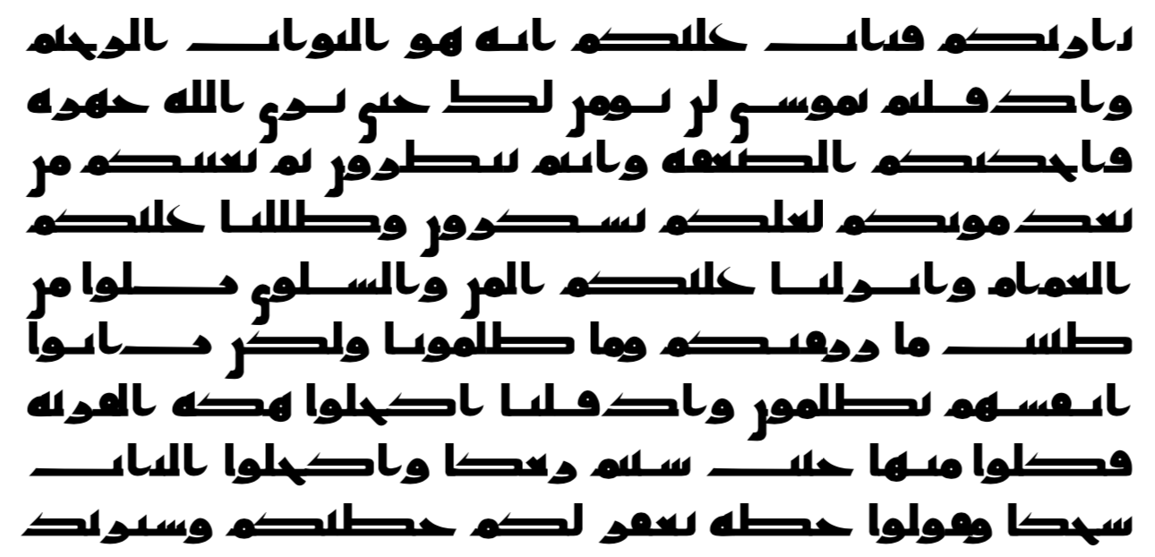
I have some Arabic content that is justified according to western conventions.

enter image description here

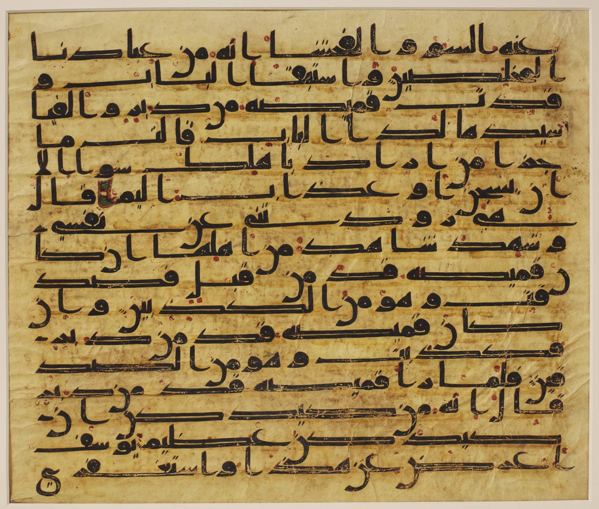
I justified it because it is justified in ancient sources:

enter image description here

However, the way Arabic text justification works is by stretching the cursive words, instead of the whitespace.

So what I would like to do is go into the font source, convert it to SVG, and pick out the individual glyphs. It is straightforward for (i.e.) Hebrew, but now I start getting lost for Arabic.

Every Arabic letter can have multiple forms (i.e., isolated, initial, medial, final, some with all, some with a few). I am ignoring the diacritics for now as the early Quran from these images above didn't use them.

What I've noticed in Arabic font rendering (and I don't know much about Arabic), is that the cursive letters change shape significantly when used in different places in a word. Maybe that's all defined by the initial/medial/final business. I'm not sure.

When I look at an Arabic font, I see individual glyphs in their isolated form. How do I see them in the initial/medial/final forms within the font? Precisely when I turn the font to SVG?

If all it is is that each letter can have 2-4 forms, and I am ignoring the diacritics, and there are let's say 28 characters in the alphabet (even less if you remove all diacritics), then in SVG I should see 2-4 * 28 glyphs, correct?

Then for the rules of the layout. If I draw an SVG path per glyph, is there anything special I need to do to connect the edges of the glyphs, so it forms continuous cursive? Do I need to test every combination of letters? Or is it somehow constructed, so I work on each letter variant on its own, and somehow because of the positioning of the strokes, everything will "connect"?

It is why I would like a brief overview of how the font rendering engine renders Arabic text. What is going on under the hood that would help me better understand how to do this project? How is it making the seamless connections between letters? How is it picking the variant (is it simply, "if it's in the middle, use medial, otherwise at the end, use final, otherwise at the beginning use initial, otherwise use isolated" type thing?)

3
  • 2
    This is not "justified according to Western conventions", it is "justified according to the code in one specific typesetting system". Which typesetting system is it? TextEdit on my Mac definitely stretches the glyphs for Arabic text, not the spaces, and so does Pages. You can expect the same on most macOS and iOS applications, and I wouldn't be surprised if Android got it right as well.
    – gnasher729
    Commented Nov 10, 2019 at 14:48
  • 2
    You ask "how the font rendering engine renders Arabic text", as if there is only one "don't rendering engine". In fact, there are multiple such engines (e.g. the current Windows engine, older Windows engines, the current macOS engine, the current Android engine, the extremely fine engine from DecoType, etc. etc.) There could be different best answers for each of these engines. Additionally, there is an Arabic writing tradition based on calligraphy, which will differ from the approximations by the various engines. I don't think this question has a single factual answer. Commented Nov 10, 2019 at 17:19
  • In the above, "don't rendering" should be "font rendering". Auto-correct let me down, then I lost internet connectivity for long enough to lose my chance to edit. Commented Nov 10, 2019 at 17:27

2 Answers 2

5

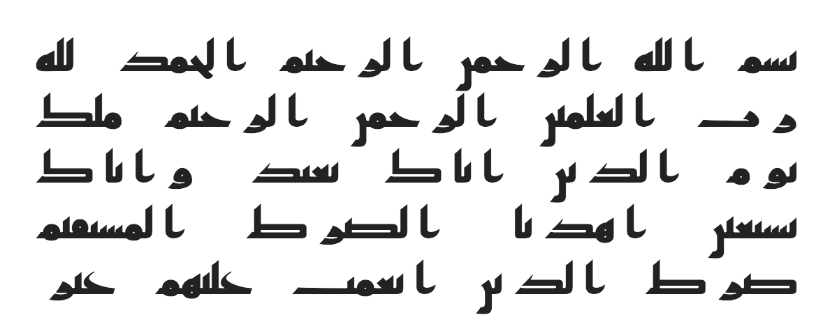
I figured it out. Took me all day but got the alignment pretty decent for that.

enter image description here

What I did was convert a font to SVG, manually copy-paste out the glyphs into JavaScript. Import each one individually into Illustrator, export with alignment in right place (and Illustrator export produces completely different SVG paths than what you provide somehow). Take the Illustrator export put it into this lifesaving SVG path editor; convert each path to absolute coordinates. If the SVG for the glyph looked like it would horizontally stretch easily, I stretched it in Illustrator, exported again, pasted into SVG path editor, and got absolute coordinates for that. Compared coordinates of stretched and unstretched SVG paths to find the moving parts, and converted the JavaScript SVG glyph into a template string with the variable parts parameterized by a scale factor.

That got me to the point of having scalable glyphs. Then I just sized the characters without stretching up to the point where the next word would go over the line, then took all the stretchable characters within that line and stretched them in random order to fill the space. Tons could be done here to optimize the design and placement of each stretched glyph, but that would take a lot of time to figure out probably, a research paper in itself.

I went through and added some slight adjustments for different characters so they merged appropriately without awkward gaps, but overall I didn't have to do too much tinkering with the glyphs themselves. They still don't look perfect but it's good enough for a first draft.

If I had more time I would design my own font and make sure all the glyphs can blend together nicely.

What I learned was that in Arabic script, in the browser, you are dealing with statically sized vector paths like with SVG (like with any other font, English, Hebrew, Chinese, etc.). The SVG was marked with "initial", "medial", "final", etc. on the glyphs, so somehow the font engines are looking for these specific features for this specific language. I didn't need to look for this, but I still don't know how it works. But basically, you just check if it's isolated/initial/medial/final and pick the glyph from that set, or fallback to isolated. The glyphs don't magically glue together like drops of water, they are just aligned properly in the fontfile (or SVG) so given the right letter spacing they will seem to "merge". It's just static glyphs, nothing fancy.

A sample glyph in JavaScript looks like this now:

const glyph = (p = 0) => `
M ${915 + p} 81
C ${915 + p} 44 ${890 + p} 0 ${828 + p} 0
H 0
C 20 20 68 72 85 100
C 144 94 ${419 + p} 85 ${738 + p} 85
C ${749 + p} 85 ${767 + p} 86 ${767 + p} 95
S ${713 + p} 112 ${682 + p} 113
C ${709 + p} 139 ${750 + p} 199 ${773 + p} 236
C ${847 + p} 205 ${915 + p} 135 ${915 + p} 81
Z
`
3
  • 1
    Kudos for the effort and result!
    – marstato
    Commented Nov 11, 2019 at 9:24
  • How did you evaluate that the result was "pretty decent"? Are you a reader of Arabic? Did you have a native reader evaluate? Or someone expert in Arabic orthography? The advantage of using system libraries is that there's a chance they have benefited from this kind of evaluation. Commented Nov 11, 2019 at 9:54
  • I am just going by (a) what looks pleasing for someone interested in learning to read Arabic, and (b) the best ancient documents (again, which have that pleasing UX), like this. Commented Nov 11, 2019 at 12:57
1

Letters in arabic can use different glyphs as you saw (to make it possible to connect cleanly with other letters), and glyphs don't have a fixed shape - certain glyphs can and will be stretched for alignment purposes. Which makes it pointless to say "I draw a glyph", exactly because it doesn't have a fixed shape.

The most promising approach you can take is to somehow take the typesetting that the operating system supplies and use that somehow for your purposes.

Your Answer

By clicking “Post Your Answer”, you agree to our terms of service and acknowledge you have read our privacy policy.

Not the answer you're looking for? Browse other questions tagged or ask your own question.